
Tabular Feature Attribution
Or, run your own with
examples/penguin/demo.py
LIT supports many techniques like salience maps and counterfactual generators for text data. But what if you have a tabular dataset? You might want to find out which features (columns) are most relevant to the model’s predictions. LIT's Feature Attribution module for tabular datasets support identification of these important features. This tutorial provides a walkthrough for this module within LIT, on the Palmer Penguins dataset.
Overview
The penguins demo is a simple classifier for predicting penguin species from the Palmer Penguins dataset. It classifies the penguins as either Adelie, Chinstrap, or Gentoo based on 6 features—body mass (g), culmen depth (mm), culmen length (mm), flipper length (mm), island, and sex.
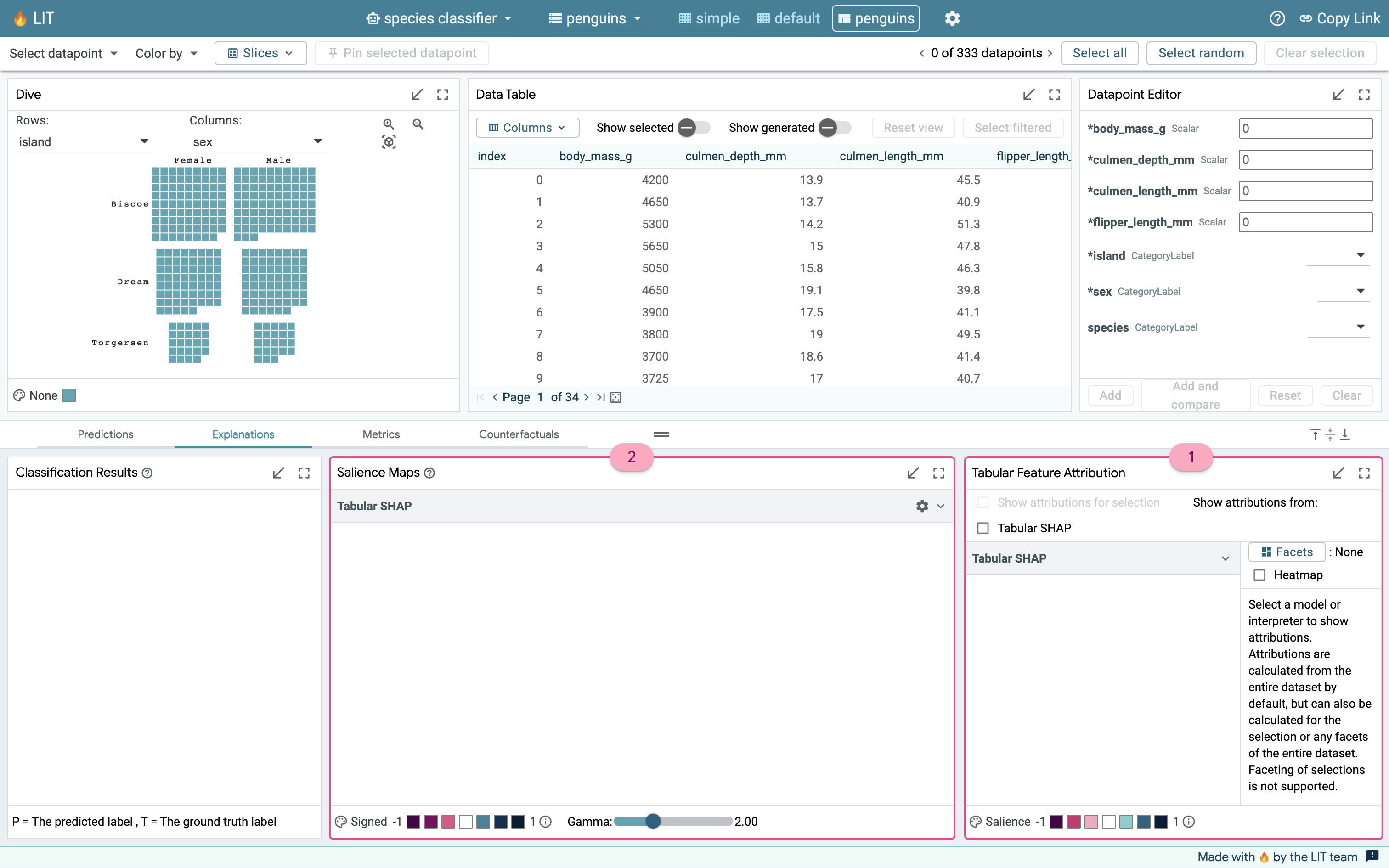
The Feature Attribution module shows up in the bottom right of the demo within the Explanations tab. It computes Shapley Additive exPlanation (SHAP) values for each feature in a set of inputs and displays these values in a table. The controls for this module are:
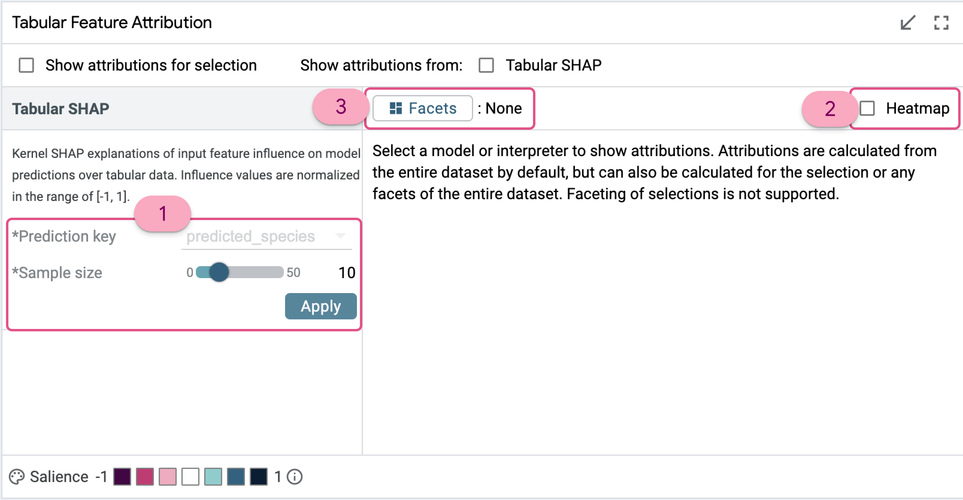
- The sample size slider, which defaults to a value of 30. SHAP computations are very expensive and it is infeasible to compute them for the entire dataset. Through testing, we found that 30 is about the maximum number of samples we can run SHAP on before performance takes a significant hit, and it becomes difficult to use above 50 examples. Clicking the Apply button will automatically check the Show attributions from the Tabular SHAP checkbox, and LIT will start computing the SHAP values.
- The prediction key selects the model output value for which influence is computed. Since the penguin mode only predicts one feature, species, this is set to species and cannot be changed. If a model can predict multiple values in different fields, for example predicting species and island or species and sex, then you could change which output field to explain before clicking Apply.
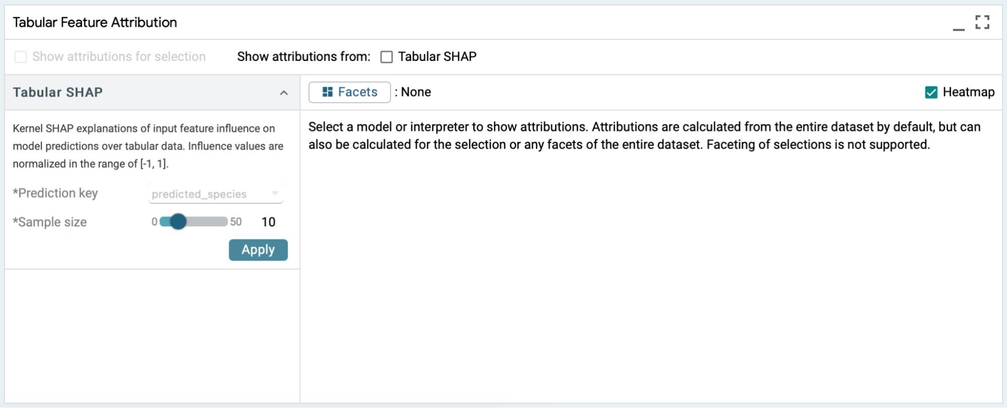
- The heatmap toggle can be enabled to color code the SHAP values.
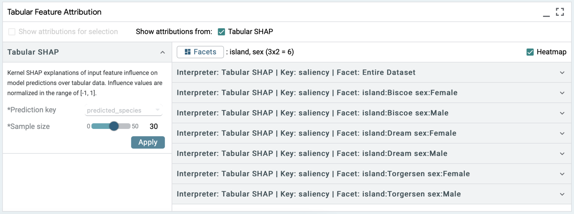
- The facets button and show attributions for selection checkbox enable conditionally running the Kernel SHAP interpreter over subsets of the data. We will get into the specifics of this with an example later on in this tutorial.
A Simple Use Case : Feature Attribution for 10 samples
To get started with the module, we set sample size to a small value, 10, and start the SHAP computation with heatmap enabled.
- If the selection is empty, LIT samples the “sample size” number of data points from the entire dataset.
- If the sample size is zero or larger than the selection, then LIT computes SHAP for the entire selection and does not sample additional data from the dataset.
- If sample size is smaller than the selection, then LIT samples the “sample size” number of data points from the selected inputs.
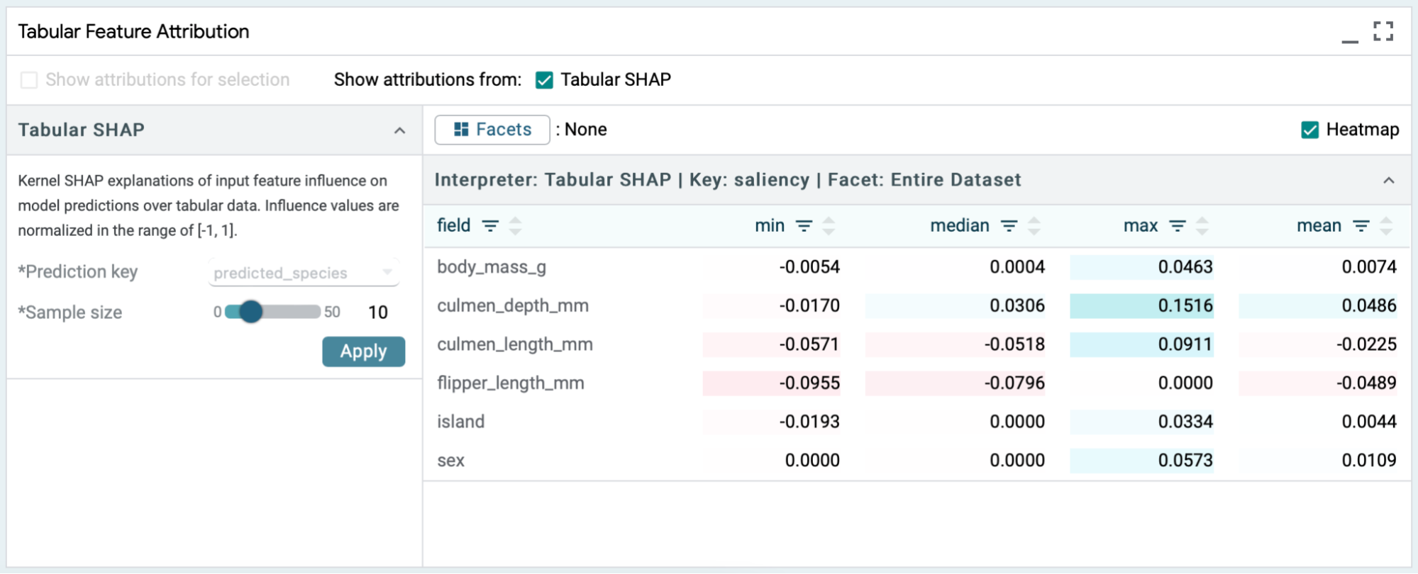
Enabling the heatmap provides a visual indicator of the polarity and strength of a feature's influence. A reddish hue indicates negative attribution for that particular feature and a bluish hue indicates positive attribution. The deeper the color the stronger its influence on the predictions.
SHAP values are computed per feature per example, from which LIT computes the mean, min, median, and max feature values across the examples. The min and max values can be used to spot any outliers during analysis. The difference between the mean and the median can be used to gain more insights about the distribution. All of this enables statistical comparisons and will be enhanced in future releases of LIT.
Each of the columns in the table can be sorted using the up (ascending) or down (descending) arrow symbols in the column headers. The table is sorted in ascending alphabetical order of input feature names (field) by default. If there are many features in a dataset this space will get crowded, so LIT offers a filter button for each of the columns to look up a particular feature or value directly.
Faceting & Binning of Features
Simply speaking, facets are subsets of the dataset based on specific feature values. We can use facets to explore differences in SHAP values between subsets. For example, instead of looking at SHAP values from 10 samples containing both male and female penguins, we can look at male penguins and female penguins separately by faceting based on sex. LIT also allows you to select multiple features for faceting, and it will generate the facets by feature crosses. For example, if you select both sex (either male or female) and island (one of Biscoe, Dream and Torgersen), then LIT will create 6 facets for (Male, Biscoe), (Male, Dream), (Male, Torgersen), (Female, Biscoe), (Female, Dream), (Female, Torgersen) and show the SHAP values for whichever facets have a non-zero number of samples.
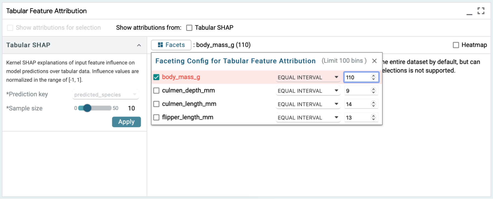
Numerical features support more complex faceting options. Faceting based on numerical features allows for defining bins using 4 methods: discrete, equal intervals, quantile, and threshold. Equal intervals will evenly divide the feature’s domain into N equal-sized bins. Quantile will create N bins that each contain (approximately) the same number of examples. Threshold creates two bins, one for the examples with values up to and including the threshold value, and one for examples with values above the threshold value. The discrete method requires specific dataset or model spec configuration, and we do not recommend using that method with this demo.
Categorical and boolean features do not have controllable binning behavior. A bin is created for each label in their vocabulary.
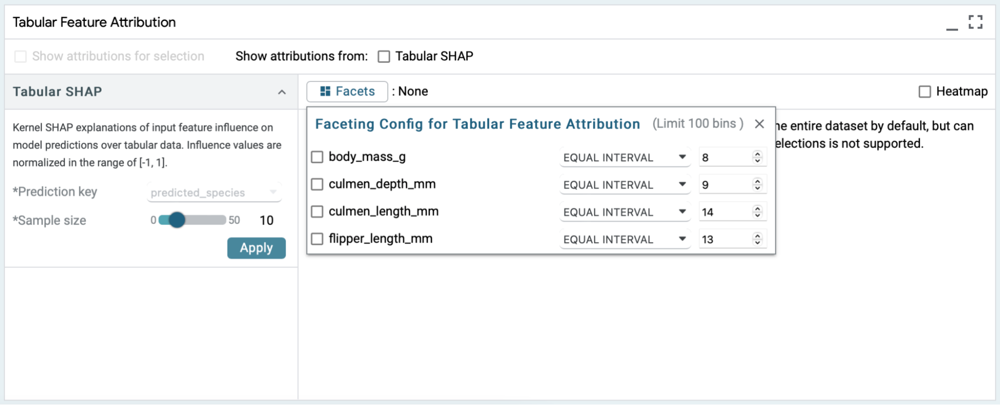
LIT supports as many as 100 facets (aka bins). An indicator in the faceting config dialog lets you know how many would be created given the current settings.
Faceting is not supported for selections, meaning that if you already have a selection of elements (let’s say 10 penguins), then facets won’t split it further.
Side-by-side comparison : Salience Maps Vs Tabular Feature Attribution
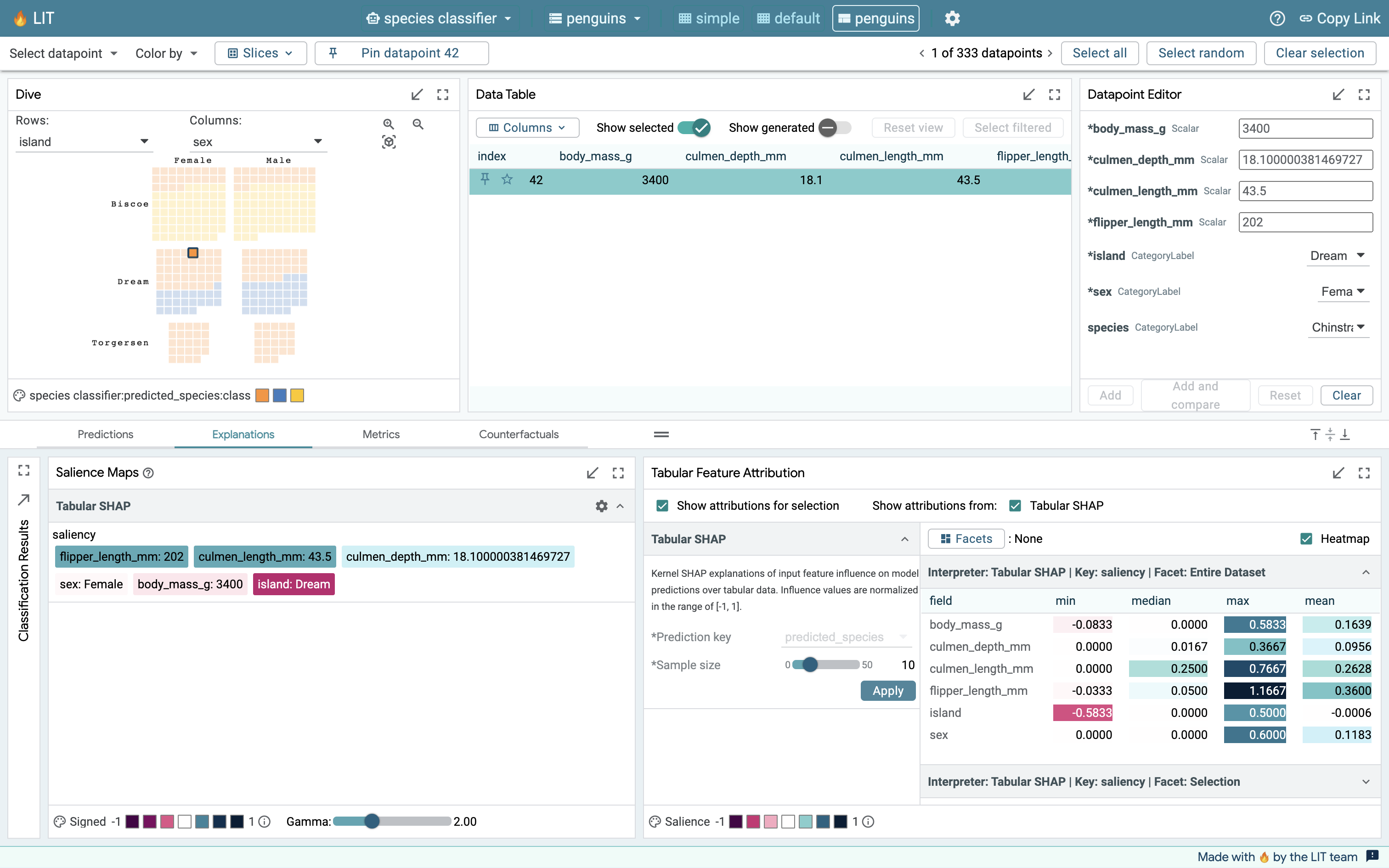
The Feature Attribution module works well in conjunction with other modules. In particular, we are going to look at the Salience Maps module which allows us to enhance our analysis. Salience Maps work on one data point at a time, whereas the Tabular Feature Attribution usually looks at a set of data points.
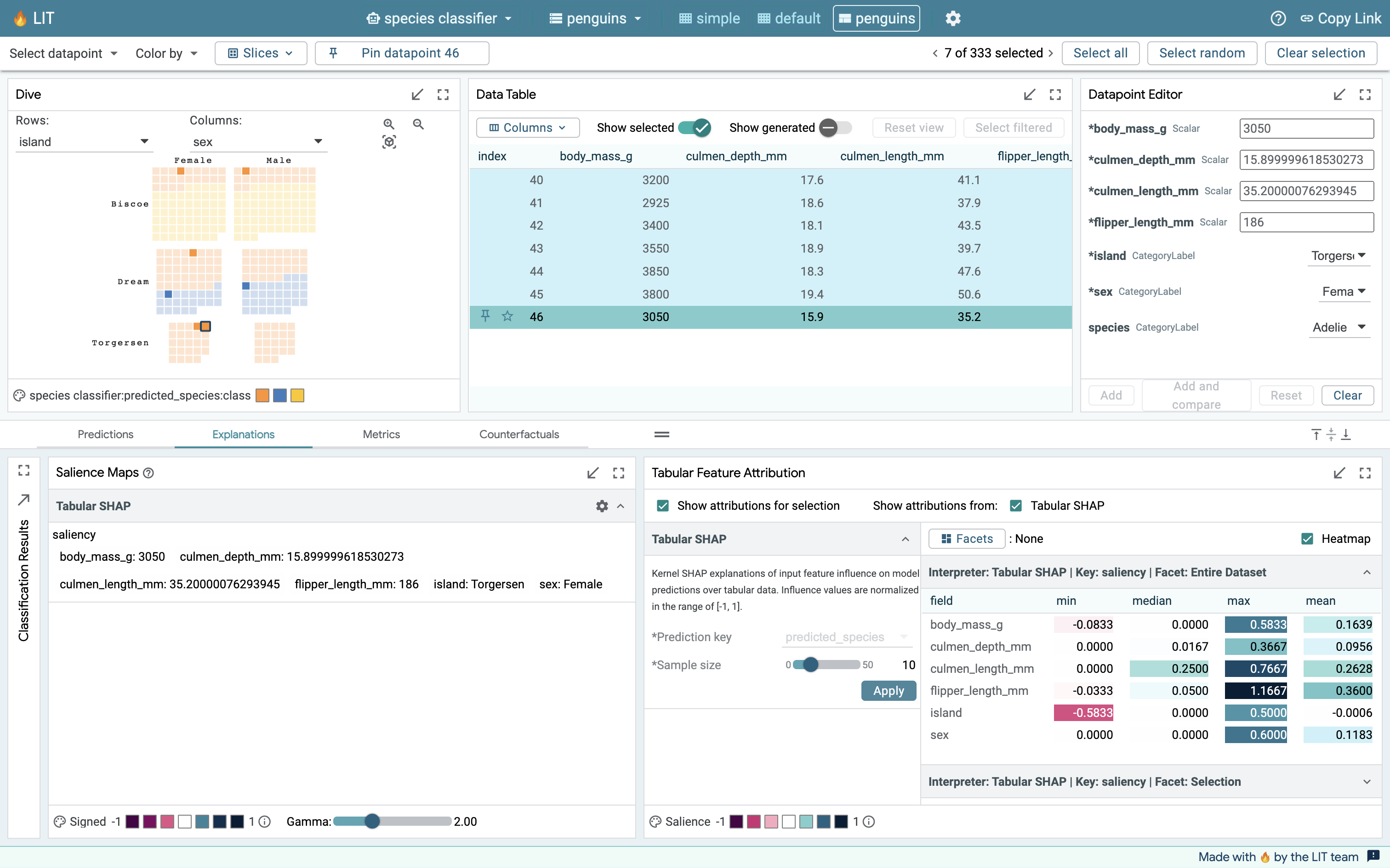
One random data point
In this example, a random data point is chosen using the select random button in the top right corner and the unselected data points are hidden in the Data Table. After running both the salience maps module and the feature attribution module for the selected point, we can see that the values in the mean column of Tabular SHAP output match the saliency scores exactly. Note also that the mean, min, median and max values are all the same when a single datapoint is selected.
A slice of 5 random data points
LIT uses a complex selection model and different modules react to it differently. Salience Maps only care about the primary selection (the data point highlighted in a deep cyan hue in the data table) in a slice of elements, whereas Feature Attribution uses the entire list of selected elements.
As we can see in this example, where we run both modules on a slice of 5 elements, the Salience Maps module is only providing its output for the primary selection (data point 0), whereas the Tabular Feature Attribution module is providing values for the entire selection by enabling the “Show attributions for selection” checkbox. This allows us to use the salience map module as a kind of magnifying glass to focus on any individual example even when we are considering a slice of examples in our exploration of the dataset.
Conclusion
Tabular Feature Attribution based on Kernel SHAP allows LIT users to explore their tabular data and find the most influential features affecting model predictions. It also integrates nicely with the Salience Maps module to allow for fine-grained inspections. This is the first of many features in LIT for exploring tabular data, and more exciting updates would be coming in future releases!


