How To - Visualize Partial Dependence Plots
The Partial Dependence Plot (PDP) shows the marginal effect of a feature on a model’s predictions. Typically, these plots are used to evaluate a model’s sensitivity to a feature.
In the What-If Tool, PDPs can be computed for a specific datapoint or globally over the whole set of datapoints.
- Datapoint-specific partial dependence plots visualize the change in prediction results across the range of values for a feature of a selected datapoint, assuming no change to other feature values.
- Global partial dependence plots visualizes, for a feature, the average of model prediction when this feature is set to specific values for all loaded data points. For example, for an "age" feature, each datapoint loaded in WIT might be edited to have its values be 10, 20, 30, 40, 50, 60 , 70, 80, 90, and 100, and the model prediction for each data point with the age feature set to 10 is averaged, same for 20, etc. Those averaged predictions are then plotted against the feature values.
PDPs for numerical and categorical data
In the What-If Tool, the PDP can be displayed for quantitative and categorical data.
- For quantitative features, WIT will display the model predictions for 10 values of the feature ranging from the minimum to the maximum values in the uploaded dataset.
- For categorical data, WIT will display the most popular other categories and the corresponding model prediction as an alternative to the category of the selected datapoint.
Visualize a PDP in WIT
Here are some steps to exploring PDPs inside the What-If Tool.
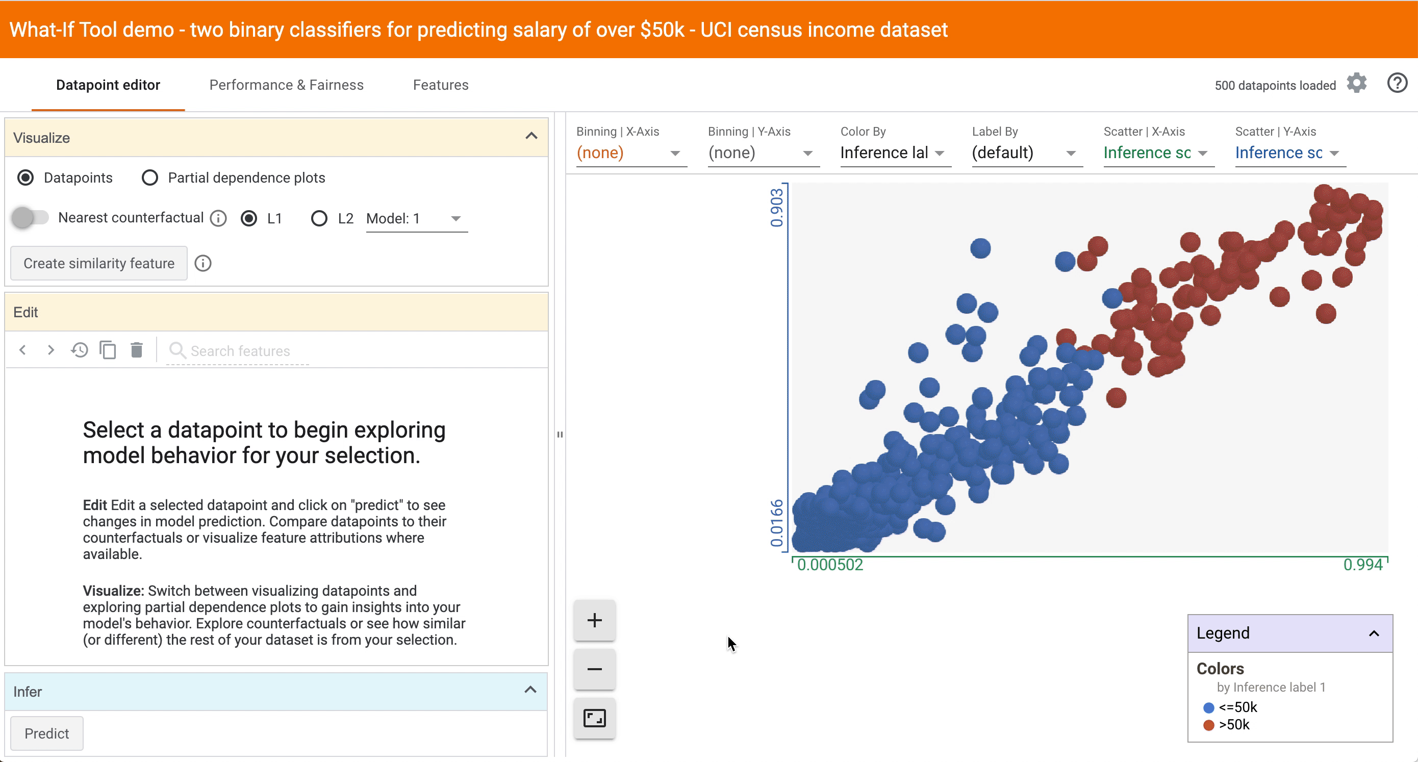
- Select a datapoint of interest in the custom Datapoints visualization by clicking on it. A list of all features and values associated with that datapoint will appear in the Edit module.
- Click on the ‘Partial dependence plots’ button in the Visualize module, on the left part of the screen. This will display PDPs for all the features of this datapoint.
-
Sort PDPs by variation. Click the ‘Sort by variation’ button to first display the PDPs with the strongest variation of model output. The more impact features have on model outcome, the more likely they are to be important features worth closer inspection.
-
Switch to Global PDPs. For global PDPs over the whole sample, you can either select the PDP button without selecting a specific datapoint, or you can click on the ‘Global partial dependence plots’ toggle to visualize prediction results averaged across all data points.
Additional features
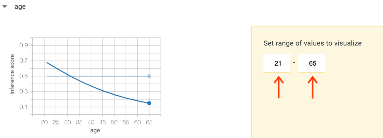
One can restrict the range in which PDPs are calculated for each feature by modifying the ‘Set range of values to visualize’ on the right of the graph.
If the datapoint contains multiple feature values for a feature, each feature value is visualized as a single plot. You can override which feature values are visualized by specifying the indices for partial dependence plots.
Example of model analysis with PDPs
This example compares two binary classification models that predict whether a person earns a yearly revenue above $50k, based on their census information. One model is a logistic regression classifier and the other is a deep neural network. We want to examine how different features affect each models' predictions. The PDP is an insightful feature for this investigation.
- The first PDP is the one for the capital gain feature. This numerical feature reports the amount of yearly capital gains earned by individuals.
- The PDP shows that the ‘capital gain’ feature plays a different role for the two models’ predictions. For the neural network (blue line) an increase in capital gain from 0 to 3000 USD decreases the model prediction that an individual earns a yearly revenue above $50k. On the contrary, the logistic regression model shows a monotonic relation between the capital grain and the likelihood of having a yearly revenue above $50k, even below 3000 USD of capital gains.
- This may look surprising at a first glance. Looking at our data, on the feature tab (seen below), we observe that the capital gain feature is highly imbalanced: 90% of its values are zeros, and the remaining 10% are either very low or very high values.

- We can hypothesize that the neural network (blue line) is treating 0 capital gains as a special value with no information in it, whereas very low (but non-0) or very high capital gains are treated as very indicative of low or high revenue. The logistic regression model doesn't have the power to make such a distinction. Whether such behaviors are desired or on the contrary need to be mitigated is case-specific and is a question for the people building and deploying the model.


