Features Overview: Understanding Your Feature Distributions
The Features Overview dashboard of the What-If Tool provides an overview of the distribution of values of each feature in the dataset loaded into the tool. It also provides the same overview for outputs from the model(s) being analyzed by the tool. The dashboard can be found by clicking on the “Features” tab in the What-If Tool.
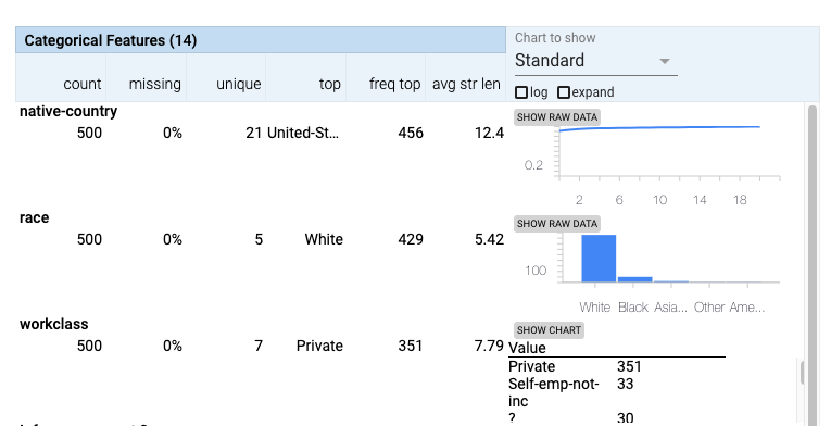
The dashboard contains two tables: one for numeric features and one for categorical features, along with a control panel. The features are separated into separate tables as the information shown in the tables is different for numeric features versus categorical features. In the tables there is a row for each feature in the dataset. Each row contains some calculated statistics about the values of that feature across the entire dataset, along with a number of charts to show the distribution of values.
Features Tables
For numeric features, these stats in the table include the minimum, maximum, mean (average) values, along with the percentage of values that are ‘0’. For categorical features, they include the number of unique values, and the most frequently-seen value. The tool does some automatic tagging of stats that may be problematic, bolding them and coloring them red, such as a feature with a high number of ‘0’ values.
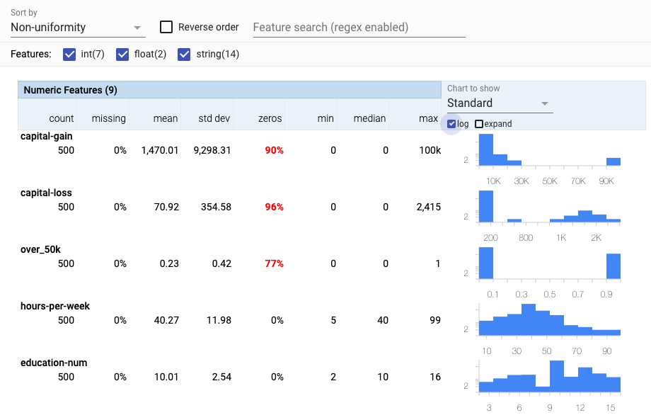
The right-side of each row contains a chart showing the distribution of values for that feature across the dataset. For numeric features, the default chart to show the distribution is a histogram, and through a drop-down menu above the charts you can change it to a quantile chart.
For categorical features, the type of chart shown depends on the number of unique values of that feature across the dataset. When there are only a small number of unique values, a bar chart is shown. Otherwise, a cumulative distribution function chart is shown, as there wouldn’t be enough room for bars for each unique value. This type of chart shows, from the most frequent value, to the least frequent value, what percentage of total values are represented by each value (and the ones before it). That is why it is a line chart that looks like a curve approaching the Y-axis value of 1 (for 100%). The steeper the initial slope, the more popular the most frequently-seen values are in the dataset. If all values are completely unique, the line will be a straight diagonal line. Additionally, a button next to the charts allows you to toggle from the chart to a data table view showing each feature value and its count in the dataset.
If using the What-If Tool with a dataset provided as tf.Example protocol buffers, each datapoint in the dataset has the ability to have more than one value for each feature. Each feature in a datapoint can contain a list of values, instead of just one. This dashboard provides one further chart for use with these types of datasets. This is a quantiles chart showing the distribution of the lengths of the feature value lists for each datapoint for each feature. In a dataset where each feature has exactly one value, this quantiles chart only contains an entry for the length of ‘1’. But for datasets with variable length feature value lists, this chart can help you understand the distribution of different value list lengths across the dataset.
Model Outputs
In addition to showing statistics and charts for each feature in the dataset, this dashboard also shows those same statistics and charts for model outputs as well. So, for classification models, this can include the predicted class and, for binary classification, the prediction score for the positive class. For regression models, this includes the predicted value of the model. If the ground truth feature is set in the Performance workspace, then rows are also added in this workspace for model correctness. For regression, this includes error statistics such as absolute error for the prediction for each datapoint. For classification, this includes correctness of the prediction for each datapoint. And lastly, if the model returns feature attributions, in addition to predictions, then the attribution values for each model input feature gets its own row as well.
Control Panel
At the top of the Features Overview dashboard is a control panel for the tables. It contains two ways to filter the features shown. A search box can be used to type in features to search for, the checkboxes can be used to hide features based on the type of data they hold.
In the control panel, there is a dropdown menu when you can change the order of the features shown in the tables. The default order, “Feature order” is the order the features were listed in the provided dataset. “Alphabetical” sorts the features alphabetically. “Amount missing/zero” sorts the features by how many of their values in the dataset are either ‘0’ or missing. This can be useful for finding features which are unexpectedly not filled in with valid values. The last sort order is “Non-uniformity” which sorts the features by how non-uniform their distribution is. This can be useful for finding features with unexpected distributions of values, such as one with surprising outlier values that don’t match with the majority of the values in the dataset.


