How to - Customize the Datapoints Visualization
The Datapoint Editor workspace has two types of visualizations in the playground: the Datapoints visualization and the Partial Dependence Plots visualization (discussed in a separate article).
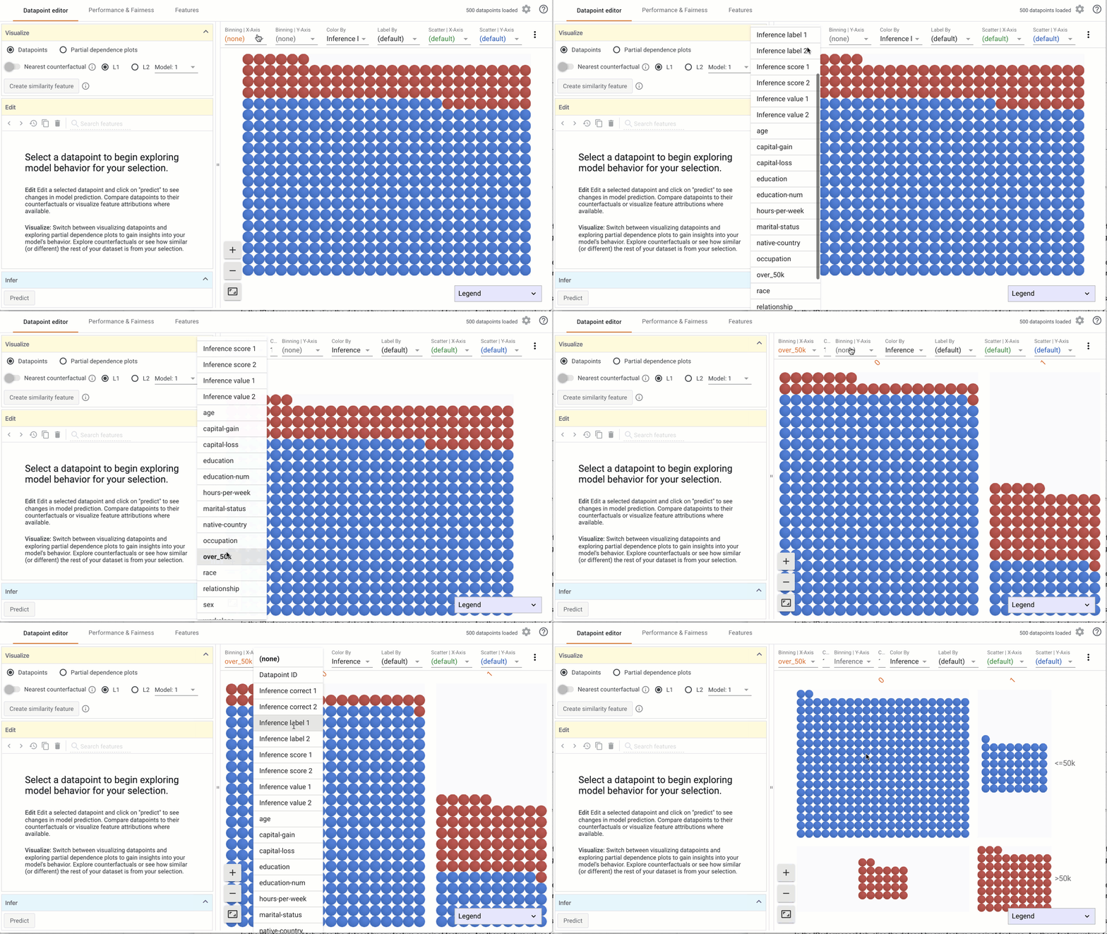
The Datapoints visualization is the default visualization in the Datapoint Editor, and is built on Facets Dive. It can be used to arrange individual data points into visualizations customized by any features available in the data set. This way, users can investigate individual data points in the context of the loaded dataset.
To customize the Datapoints visualization:
- Select Datapoints in the Visualize module to see the datapoints visualization. The What-If Tool looks for meaningful defaults based on the model type and number of available models to help users get started.
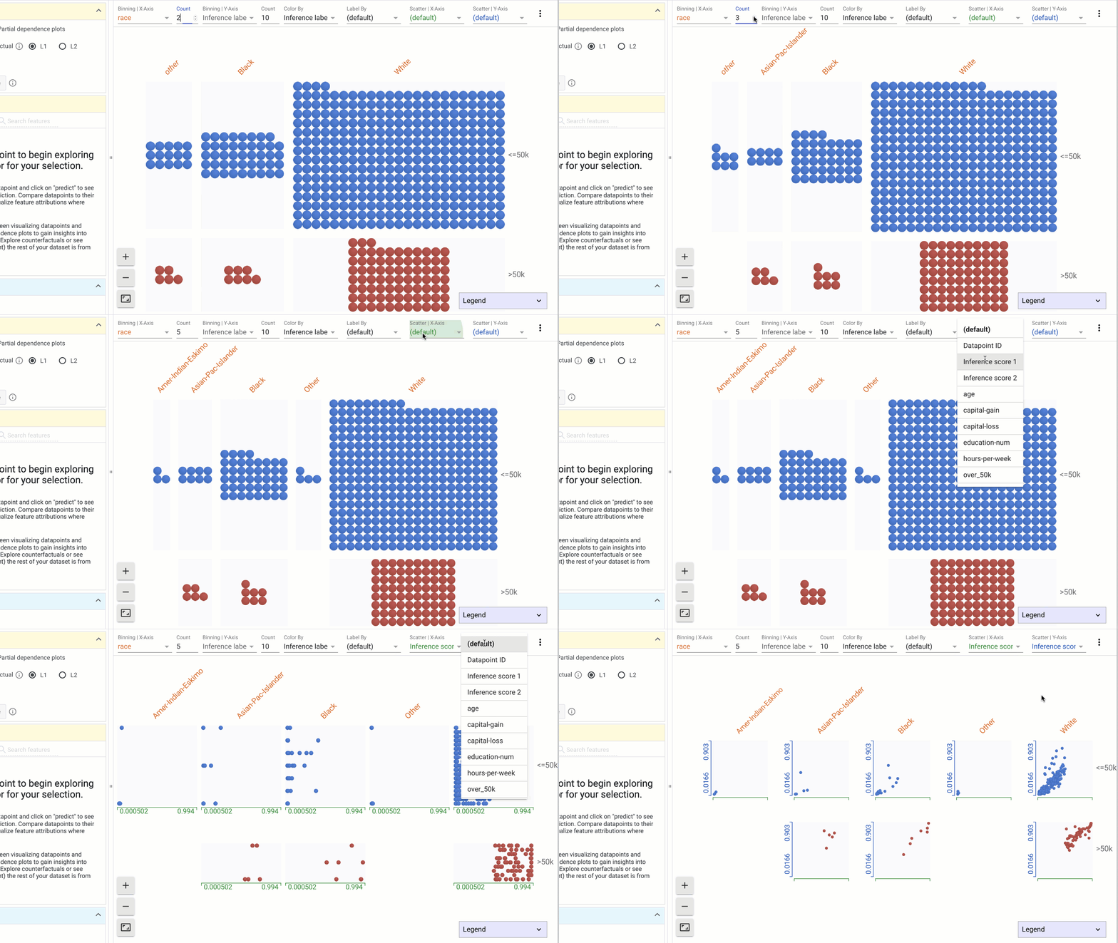
- Using the dropdowns in the toolbar on top, specify features to visualize on the X-axis, Y-axis, color or labels. Combinations of these can be used to create histograms or scatterplots, or combinations of the two: a. Binning | X-Axis: This dropdown is used to select a feature to organize data points into buckets as a histogram on the X-Axis. The count dropdown specifies the number of buckets to create. b. Binning | Y-Axis: This dropdown is used to select a feature to organize data points into buckets as a histogram on the Y-Axis. The count dropdown specifies the number of buckets to create.

c. Color by: This dropdown is used to select a feature to color the data points. i. If a categorical feature is selected, a different color is used for each category. ii. If a numerical feature is selected, data points are colored using a two-color (sequential) colorscale.
d. Label by: This dropdown is used to specify a feature to label by. i. Numerical and categorical values are rendered as text over the Datapoint. ii. Features with image values are displayed as thumbnails
e. Scatter by | X-Axis: This dropdown is used to select a numerical feature to scatter data points on the X-Axis. The range of the X-Axis is determined by the minimum and maximum of selected feature values.
f. Scatter by | Y-Axis: This dropdown is used to select a numerical feature to scatter data points on the Y-Axis. The range of the X-Axis is determined by the minimum and maximum of selected feature values.
- Setting a dropdown value to none removes the features from the visualization.

Other interactions in the Datapoints visualization include:
- To select a datapoint, click on the datapoint and see individual feature values in the Edit module.
- To deselect a datapoint, click anywhere else in the visualization.
- To zoom into the visualization, click on the zoom in (+) icon or scroll in using your mouse.
- To zoom out of the visualization, click on the zoom out (-) icon or scroll out using your mouse.
- To reset the visualization, click on the frame icon.
- To pan the visualization, click and drag the mouse.
- Collapse or expand the legend by clicking on the down icon in the header.


