Exploring Attributions in the What-If Tool
Exploring feature attributions is a great way to understand what features a model is relying on when making a prediction. Many techniques exist to get feature attributions from a model’s predictions, such as LIME, integrated gradients, and shapley values. WIT allows users to consume feature attributions from any technique along with model predictions, and then uses those attributions to enhance its visualizations.
The feature attributions can be provided to WIT in one of two ways:
- Through a Cloud AI Platform model that has explanations enabled. Details on setting up WIT for a Cloud AI Platform model can be found in the Getting Started in Notebooks tutorial.
- Through a custom prediction function that returns feature attributions for each prediction, in addition to the standard prediction results. This can be done for WIT in either TensorBoard or notebooks. See the tutorial on custom prediction functions in WIT for details on how to set this up. The user defines how the attributions are calculated and WIT then takes those attributions and adds them to its visualizations.
Attribution Visualizations
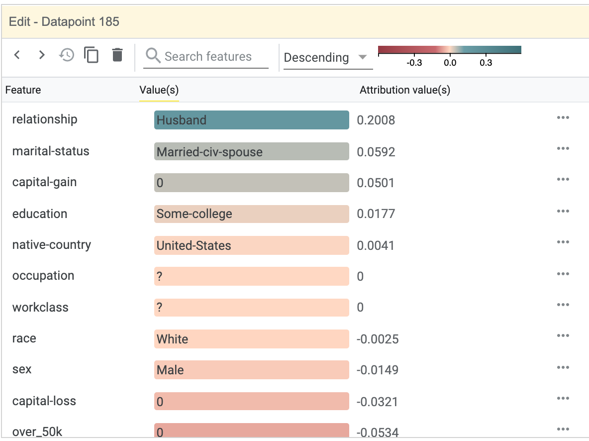
When attributions are returned along with predictions, new visualizations are enabled in WIT. When selecting a datapoint, the Datapoint Editor will do three things with the attribution information:
- Features in the datapoint will be sorted by their attribution values, with the features with the highest attributions being at the top of the list. This sort order can be changed by a dropdown at the top of the Datapoint Editor.
- The exact attribution values for each feature will be listed next to each feature value.
- The feature values will have their background colored by their feature attribution scores, to allow at-a-glance understanding of the individual feature attributions.
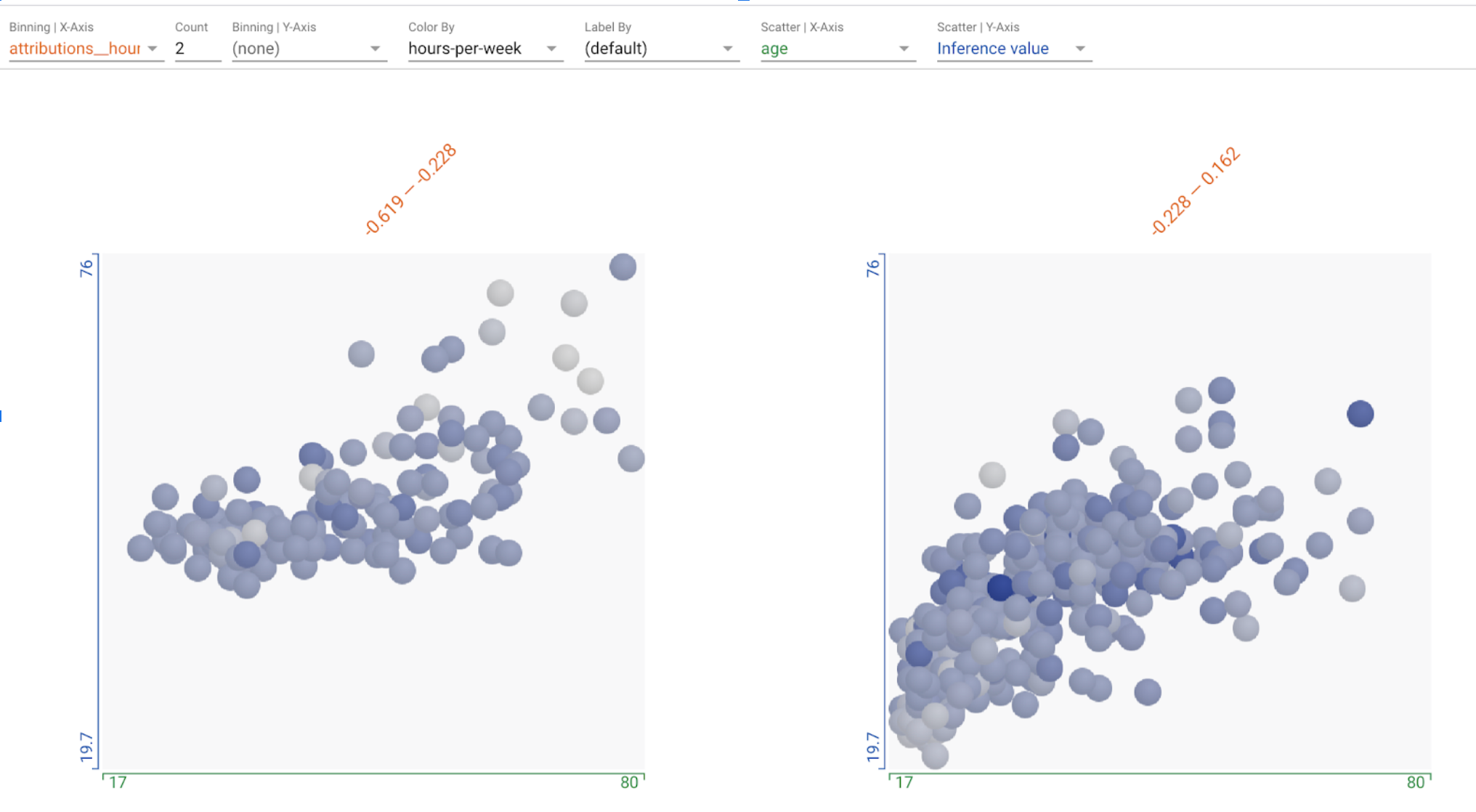
Additionally, the feature attribution values can be used in the datapoints visualization, as a way to organize the datapoints, using those values to control scatter plot axes, datapoint binning, or datapoint coloring.
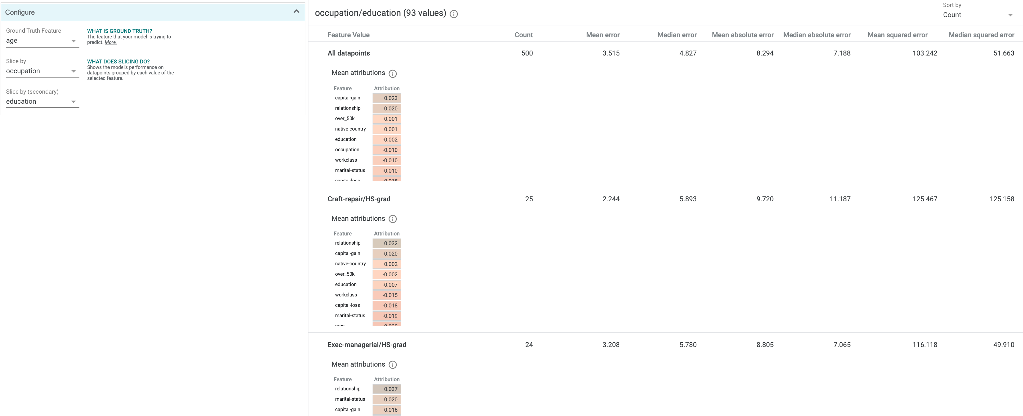
In the “Performance” tab, in addition to the standard metrics that are calculated and shown, there will be a table of mean feature attributions across the entire dataset, sorted with the highest-attributed feature at the top. If you slice a dataset in this tab, each slice will have its own mean attributions table. This table uses the same color scale as the attribution value-based background colors in the Datapoint Editor. You can also use the feature attributions as a dimension to slice your dataset on in this tab, such as slicing the dataset into those with high attribution on a specific feature, versus those with low attribution on that feature, in order to compare the performance metrics on those two slices.
Attribution-based Counterfactuals
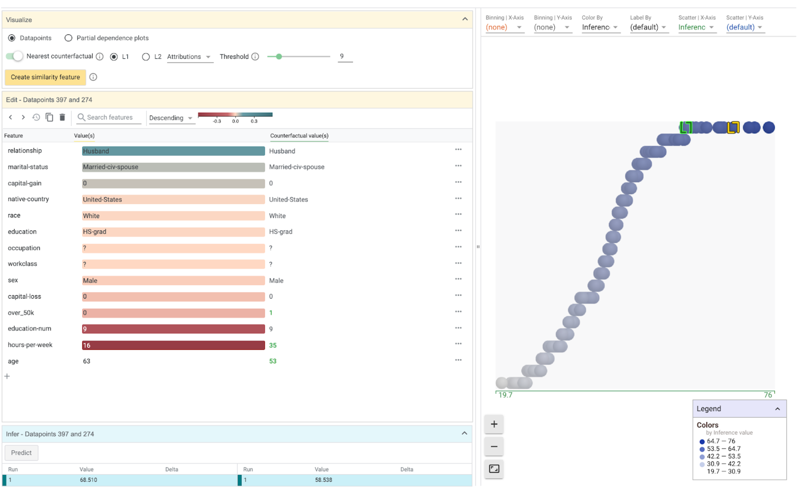
When attributions are provided to WIT, its counterfactual-generating capabilities are enhanced. In addition to being able to find nearest counterfactuals through datapoint feature value similarity, you can find nearest counterfactuals through attribution similarity. Switching to using attribution-based distance is controlled by a dropdown in the counterfactual controls area in the Vizualize module in the Datapoint Editor tab.
When finding nearest counterfactuals by attribution distance, WIT calculates the distance between two datapoints based on the difference in attribution values for each feature of a datapoint, instead of the difference in feature values. This gives you another way to explore the decision boundary of a model for a given datapoint, based purely on attributions from whatever methodology you are using to calculate feature-wise attributions.