Researchers at Google have built a model that takes a high resolution image of prostate tissue and predicts the severity of cancer present. It does this by splitting the image into thousands of tiny square patches and assigning each a Gleason pattern:
To explore the use of model assistance in pathology, pathologists use a fullscreen version of this interface while grading tissue slides. Patches with the same pattern are grouped together and given a colored outline.
This works well for pathologists; seeing the tissue is crucial and the region outlines don’t obscure the underlying histology too much. But it’s missing a key piece of information: how confident the model is in its predictions in different areas of the slide.
Underlying the Gleason pattern prediction for each patch are the model softmax value outputs. Each of the four patterns has a softmax value, representing the probability that the patch is that pattern. A patch with softmax values
The machine learning models make different kinds of mistakes than humans. If pathologists know when to override the model and when to trust it, the human-model combination will be more accurate than either acting alone. This blog post describes the iterative process of designing an interface to show uncertainty—the tradeoffs between information density and legibility; the gap between the design and experience of use; and the impact small adjustments can have on the effectiveness of a visualization.
Here, each patch is colored based on the class of its argmax (the highest softmax value and the model’s prediction for that patch). On the left, the magnitude of the argmax determines the size of each patch; smaller squares surrounded by more white space indicate more uncertainty. On the right example, patches where the magnitude of the argmax is lower and uncertainty is higher are tinted white.
To see the tissue, pathologists could press a button to toggle the confidence overlay. They found the tinted squares easier to read; zooming changes the white space between the sized squares and adds aliasing artifacts.
One disadvantage of tinting is that comparing uncertainty between classes is difficult. A legend and non-RGB color space would alleviate some of this, but size is always going to be a more exact channel.
Along with the model’s certainty in its top prediction, the softmax values also tell us the model’s second best guess. In areas where the model wasn’t confident, pathologists were especially interested in what alternatives the model was considering. If the model’s second guess matched their initial read of the slide, they trusted the model when reading subsequent slides.
The two most likely classes are now shown. In the left example, patches are colored by interpolating between the top two class colors using the ratio of their softmax values. On the right, the top classes are shown as two overlaid squares. The color of the argmax is used as the background and a square with the color of the second class, sized proportional to the ratio, is overlaid.
I initially preferred interpolating between colors—smoother transitions between classes more closely match my intuition for how tissue transitions between Gleason patterns—but there’s a problem in the bottom right of the slide.
In areas where there are three classes close in probability, color interpolation creates discontinuities that are difficult to reason about.
There’s still a discontinuity with two overlaid squares, but it’s easier to understand than mixed colors, which get read by our visual system in a single channel.
Not all discontinuities are bad. The model counts the number of patches with each argmax to grade the entire slide; in this context swapping the order of the squares usefully demarcates the top prediction.
We also have the probabilities for the model’s third and fourth choices.
Each patch has a small stacked bar chart drawn in it, with the height of each class color showing its softmax value.
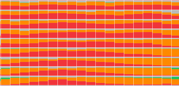
Zoomed in, this creates a nice effect; you can see there’s a spot that the model thinks is
But pathologists weren't impressed. Zoomed out, there are aliasing artifacts and zoomed in, there’s almost too much information to parse. One pathologist described it as “nauseating”; they’re looking at these slides all day and want something more visually appealing.
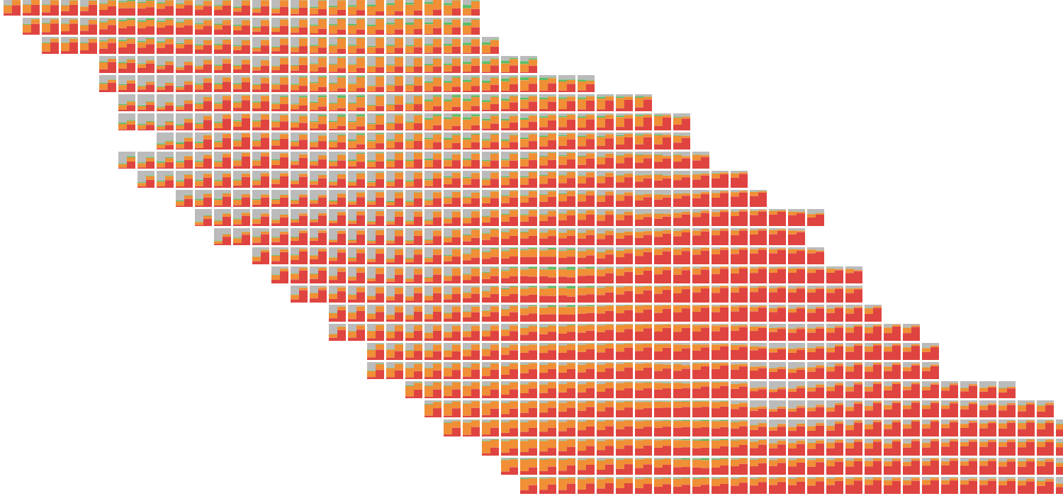
I loaded two versions of the model and drew two bar charts in each patch. The bars on the left side of the patch show an earlier run of the model.
Using opacity to highlight places where the argmax differs between the models pulls out the most important information. On the left side of the slide, for example, it’s easy to see that the model switched from predicting
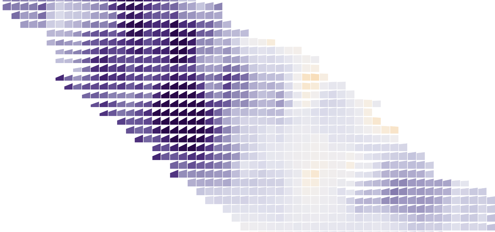
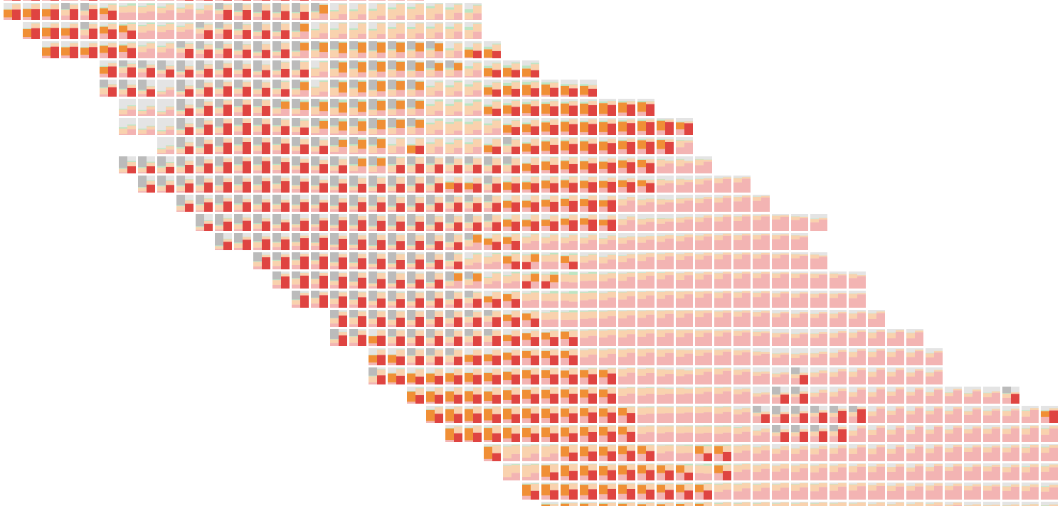
Like highlighting, showing less information can increase clarity. Above, each patch has a slope chart showing the change in percent chance of tumor between two runs of the model. Color also encodes change (purple shows places where the model now thinks tumorous cells are more likely), so it’s readable at multiple zoom levels.
An even simpler approach is also useful–the tinted argmax overlaid with an expert pathologist’s annotations. This helps verify the model is working and highlights regions for improvement.
After interviewing pathologists, it seemed like showing the top two classes as overlaid squares struck the best balance between providing useful information without being overwhelming. Wanting to squeeze just a little bit more information in (the top two squares only encode the ratio between the top two classes, so
The idea seemed elegant in my head, but created lots of visually noisy “L” shapes in practice.
I tried simplifying by only stacking bars instead of boxes, but that ended up being basically equivalent to the stacked bars showing all four classes.
To keep everything in a uniform grid while displaying more than one bit of information per patch, I rounded the softmax values off to quarters and drew four tiny squares on each patch.
This shows about as much model information as is useful for pathologists while avoiding the overload that comes with showing every 5% or 8% prediction.
Using the sort order of the four squares in each patch to encode the argmax—it’s always upper left—brings small shifts in probabilities into focus, but the banding is overwhelming.
Pathologists like playing around with these interfaces to get a sense of how the model thinks, but were skeptical they’d use them in their daily work. Grading a slide requires looking at tissue, which is covered up by the confidence overlay.
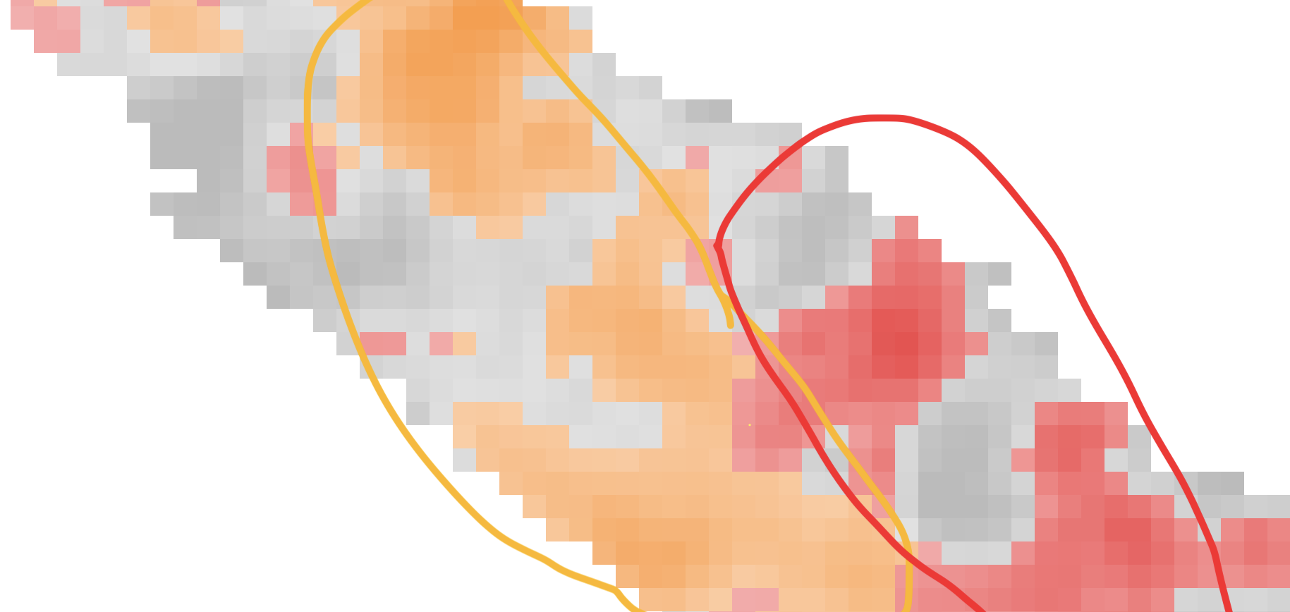
To show tissue and uncertainty at the same time, I experimented with contours. These topographical map-style outlines leave most of the tissue exposed.
Unfortunately, they get unreadable when different classes overlap with each other.
Separate contours for each class could work, but I don’t think it would improve much on a simpler small multiple display showing the softmax for each pattern.
Replacing contour outlines with filled shapes clears up the messy overlaps.
Pathologists also liked the appearance of the filled contours (they matched their mental model of smooth transitions between patterns. And turning down the opacity of
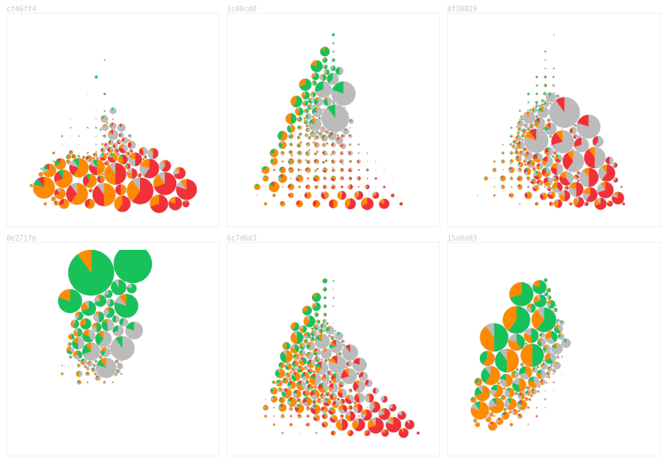
There aren’t enough pixels to show each patch’s softmax values and maintain tissue visibility while zoomed out. By aggregating patches based on the zoom level within circles, the uncertainty of different sections of the slide is shown while not totally obscuring the tissue.
I was initially optimistic about this display: it could replace the argmax outlines of the model’s predictions! But the pies don’t nicely cohere in the same way an outline does and reading the slide requires lots of conscious effort.
Pathologists were also confused about the space between the circles. I tried converting the pies to squares and rounding off the aggregated uncertainty to quarters. This made the concept less confusing, but there was even less of a Gestalt effect.
In addition to the zoom level, the visible extent also provides valuable information. While pathologists read the slide like they normally do, the confidence display could update without explicit interaction.
The size of each circle below shows the number of currently visible patches with approximately that softmax value (a half red / half yellow circle represents patches that are about 50% / 50%
Pathologists were confused by this view, frequently asking why circles in the lower left didn’t match the tissue of the lower left of the slide. The force-directed pies might work as part of a triage workflow, helping pick out the most difficult case to grade first.
Each of these provides a nifty thumbprint about the model’s understanding of the slide.
There’s also the position of the pathologist’s mouse. Instead of covering up the whole slide with the top two overlay, an inset shows confidence in the region around the mouse.
Quickly toggling the whole slide confidence overlay is easier to read for experienced users than the inset—you don’t have to look back and forth quite as much—but it is an additional step to perform. Always present in the corner and not requiring intentional interaction, the inset was more approachable for pathologists using the interface for the first time.
Pathologists don’t mind reading slides with region outlines. Can confidence be shown as an outline?
I started by adding a new region type representing
Pathologists missed seeing the model’s second best guess and weren’t sure how to use uncertain areas. I had hoped to try out a workflow where the model graded the “easy” regions and left the unconfident regions for the pathologists to grade, but the uncertain areas weren’t contiguous enough.
For a binary classification task, like marking tissue as either
To show the model’s second best guess, I also tried drawing regions where the model was having trouble deciding between two classes as outlines with two alternating colors.
Again, the noisiness of patch level predictions makes this hard to read.
Instead of trying to cram all this information into a static set of pixels, I tried using animation.
This chart spawns particles based on the softmax values at each patch. Different classes move in different directions, providing some preattentive texture.
Zoomed out, it isn’t immediately apparent that some of the areas in the
Hypothetical outcome plots are another popular way of showing uncertainty. Below, a random class is drawn from the softmax distribution at each patch every frame.
Unfortunately, this isn’t a real hypothetical outcome plot; if a given patch is benign, its neighbors are more likely to be
The current design of the model only outputs softmax values for individual patches without indicating their correlation, making it difficult to sample from the distribution of possible patches. Why not let the pathologists do the sampling themselves?
Mousing over the heatmap reweights the softmax values. Moving
To ease them into this idea of slide-wide uncertainty, I broke the continuous space into nine separate calibrations and asked each pathologist to think of them as nine expert opinions. They’re used to dealing with differing diagnoses; even getting concordant grading from experts to train and evaluate the model on is surprisingly difficult!
Each of the calibration weights are represented by a small bar chart showing the percent of tissue covered by each pattern.
Grouping the calibrations by their Gleason grade gives a good sense of slide-wide uncertainty. Here the model predicts more
There’s also a static version of this idea, overlaying sketchy versions of the calibration weights.
Non-blocky shapes were a positive, but it was hard to read the slide underneath all the lines. The most interesting places, where the model is uncertain and adjusting the calibration moves the argmax boundaries, are the hardest to read because they’re covered in squiggles.
Do these techniques work with other data? In 2015, DNAInfoNYC asked thousands of readers to draw the outline of their neighborhood. As with the prostate slide, there are uncertain boundaries and underlying tissue/streets.
The sketchy outlines work naturally; here each outline is one person’s drawing of a neighborhood.
I thought some of the patch-based techniques might help answer where, exactly, the line betweenBut they’re not that compelling compared to outlines. Neighborhoods are more contiguous than potential tumors. They usually have well defined centers (the borders of Astoria are fuzzy, but everyone agrees on the middle bit) and don’t manifest as chunks that have a 20% chance of existing. The loss of resolution also hurts more; streets are meaningful and don’t align with the grid.
The patch-level uncertainty is noisy and emphasizes the borders between argmax regions. This accurately represents the model’s output, but the exact location of the switch between
Currently, our designs have explored patch-level uncertainty and slide-wide uncertainty. When pathologists talk about uncertainty, though, they refer to regions and glands: “That area looks like it could be
Generating confidence visualizations for such a model or for other types of tissue will require tweaks to the techniques presented here. Small differences change the effectiveness of visualizations in unexpected ways. Switching from four classes to two classes made
Adam Pearce // February 2020
Ben Wedin, Carrie Cai, Davis Foote, Dave Steiner, Emily Reif, Jimbo Wilson, Kunal Nagpal, Fernanda Viegas, Martin Wattenberg, Michael Terry, Pan-Pan Jiang, Rory Sayres, Samantha Winter and Zan Armstrong made this work possible and had many helpful comments.